The Tokyo 2020 Olympic Games was scheduled to take place in the summer of 2020, but was postponed on the 24th March to the summer of 2021. As the biggest sporting event in the world, the logo accompanying it is sure to come under intense scruntiny, as a symbol of the event that would be plastered everywhere, from TV to soft drink cans. The 2008 Beijing Olympics attracted 3.5 billion viewers who had saw some part of the 16 day event, as a reference.
![]()
The logo features boxes that range in size and width, arranged in a warped shape. The text below the logo, ‘TOKYO 2020’, is in a slightly thinned DIN font. Unlike the logo above it, the text looks like it is emphasised as it is in a straight line and is spaced out, in contrast to the warped and patterned logo. The logo drew criticisms from the public, as out of all the final logos chosen, this was the only one that didn’t feature a multitude of colours. The design was meant to symbolise harmony, and unity in diversity with the different sizes of boxes. However, the font used was the boldest, as the other 3 finalist entries featured serifs on the letters, with thinner text.
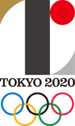
Going backwards in time to 2015, the preliminary logo for the Tokyo Olympics was released and is displayed above. The typography utilised in this logo here is Clarendon, featuring long serifs to compliment the thin structure of letters. In addition to this, the big T in the middle of the logo itself is inspired by the typefaces of Didicot and Bodoni. The designer, Kenjiro Sano, said he wanted to model the design off these fonts as he felt they would be ‘appealing strength and sensitivity’. The colossal letter T also symbolises the themes of ‘Tokyo’, ‘Tomorrow’ and ‘Team. The use of Clarendon as the main typeface also confused many, as it was comapred to the J-League logo, the premier football league in Japan. The logo was deemed too bland and not fit to a sporting event, with the committee swapping to the warped logo with the bolder DIN typeface in 2016, designed by Asao Takolo.